

The Brief
The Green Man at Lindsell was originally a pub, closed for some time it had been taken over by four partners, including a chef, and renovated to be made into a new, modern-European restaurant.
The Green Man needed a full branding service, logos, cards, menus, headed paper, font choices and all. The first thing to be designed was the logo, this included a choice of colour and basic ideas. Since they were called the Green Man they felt that the colour green should probably feature in their branding.





The Process
We began with a comprehensive discussion with the client over the look, feel, colour scheme and ideal customer for their brand. We needed to understand exactly what they wanted to achieve from it. Helping us to clearly define their objectives and their messages we were able to put together a design that would suit their needs.
Based just five minutes outside the small but affluent town of Great Dunmow in Essex their target customers were generally well-off, middle class professionals and business people who lived in and around the area. This helped guide the band appearance to the likely tastes of that target customer.
Design & Print
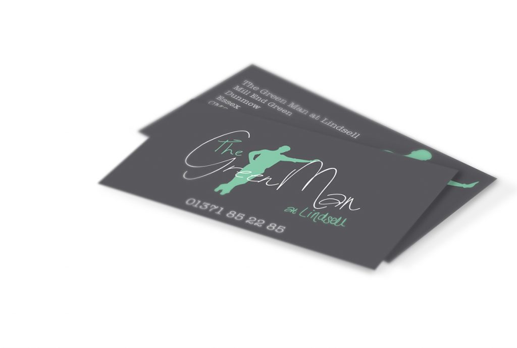
The brand, once completed, then had to go onto the business cards, menus, menu cases, signs, doors and walls of the restaurant. The colours chosen were a green a charcoal grey encompassing a white text. The little leaning figure of the green man resting against the ‘M’ was very much favoured by the client and chosen as the icon to for the rest of their branding.
A font was suggested and chosen that would compliment the hand-drawn logo, as the font in the logo couldn’t be replicated, one that would fit alongside with it would need to be chosen instead. This font was then used across the menus and website to keep brand continuity and maintain a professional overall look and feel.
Ongoing Work
The restaurant has been going from strength to strength and in recent times has progressed onto looking at the improvement of some of their branding. The logo is to remain the same but the signs, menus and other printed materials are to be put onto higher-quality paper and presented differently in ways that will boost the overall feel of the place for all visiting customers.
Work will continue as they push toward their goal of being a well-recognised and desired restaurant, leading their area in culinary excellence. We would recommend the duck or the lobster thermidor, both are very good indeed!